Raphael’s School of Beauty

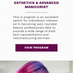
Raphael’s is a project of which I’m particularly proud. This website took a big longer time to build because I put a lot more effort into it than I have some other projects. Raphael’s was a long term client at Oozle Media, and I wanted to make them especially happy with their new site. (Not that I don’t make an effort on other sites – just that this one took 150% of my effort!) This was a rather large site in terms of pages, and they also wanted to customize specific programs, since they had separate campuses for different programs. You can see the difference on their Barbering Program page as well as the Massage School page. The challenge for me was finding a way to customize that without forcing someone to put in a lot of work in the back end.
As with many sites that have really lengthy program pages (or other types of content), I added a lot of custom styles to break up the page content a bit. In this case, I had some help from the designer, but I did still have to sort of “wing it” on a lot of elements. After doing this for ten years, though, I’ve found I can come up with minor colorful page elements much more easily than when I started.
This site included a couple of features that I had learned performed really well on beauty school sites. First, on the homepage, you can see that there is a series of checkboxes with questions you might have. This engages potential customers and lets them know that they’re not filling out a form just to be spammed. Second, there are a lot of references to a quiz. The beauty quiz just asks some basic questions, but it’s super engaging and encourages people who might have been on the fence to fill out the form and ultimately become leads for the school. You can see these changes between the current live site and the original designs included in this gallery.
The end result was that we took their conversion rate from around 3-4% to 12-13%. Even we were blown away by the numbers. I asked my project manager to run them again 3 different ways just because I was so surprised. But nope, this site just performed like gangbusters.
Description
Raphael's Beauty School
August 2020
An impressive beauty school that was taken from already high conversion rates to incredible conversions that even I hadn't hit at that point. Just a perfect storm of a website.


