Providence Hall

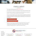
This site is memorable for me for a few reasons. First, the client was a really pleasant guy who was pretty cheerful about all the work I was doing for him. Second, I built the sub menus on the nav differently than I’d been doing them in the past, with hover effects that I just liked for some reason. And third, most importantly, this was the first Frogtummy site I was re-building, and it was an absolute nightmare. We did sites for a few schools that had been with Frogtummy, and (at least in the past) they were not great. Far, far too many pages, really badly coded, no organization at all. Just sorting out the new sitemap took days of work. It was… a lot.
The site is mostly the same as it used to be, with some coding changes I can see on subpages. They’ve been adding way too many things to the menu and now it’s too crowded. But maybe that’s just one of the drawbacks of having a website for a charter school.
Description
Providence Hall
August 2018
One of the first charter school sites I ever built. Charter schools can have really big, complex needs in terms of site maps and SEO. This one was a challenge to clean up and organize, but the end result was beautiful.


