Evergreen Beauty

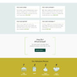
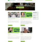
This project began with an extensive study in CRO performed by my project manager, Cassie. The existing site, which we did not build, was studied using HotJar and related tools for months to determine how people were using the site and the best way to improve on it. Our designer, Hannah, then came up with this new design based on that research, and I put it all together. The end result was that conversions more than doubled (though I can’t remember the exact numbers, as it was a long time ago).
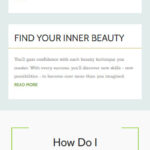
This site featured super long course pages that required a floating, sticky menu on the side to navigate to specific areas. That was a bit of a challenge on smaller screen sizes, but I think I ultimately made it work out.
Shortly after the site launched, the pandemic struck and this client quit services with Oozle Media. They simply couldn’t afford to continue services when they were forced to shut down, hopefully temporarily. I ended up leaving Oozle Media soon after that. When taking screenshots of this site for this portfolio, I noticed the addition of some code that wasn’t mine. Obviously that’s normal when a client switches providers. But it does mean it didn’t quite look like my original site. I removed a few styles using the element inspector to take the attached screenshots but didn’t adjust everything, so some pieces of this feel out of place to me (like missing padding) but it’s close enough.
Description
Evergreen Beauty
Spring 2020
A custom site design based on extensive CRO research, this site dramatically improved conversions for the client.

