Carrus

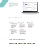
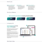
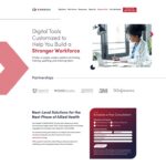
As the web director at my new employer, CareerStep, I’m in charge of the web properties for both careerstep.com and carruslearn.com (the parent company). The site was rebranded along with the company itself, which is now a SAAS tech company providing a learning platform to train healthcare workers at clinics and hospitals. It’s a big deal and I’m proud to be a part of something so important.
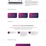
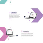
This site represents the first time that I’ve written CSS animations from scratch. I had to animate several pieces of the site as you scroll down – some are triggered by the scroll hitting waypoints, and some are animations that move along with scrolling. I learned a lot more about graphic animations than I wanted to, to be perfectly honest. But now that I’ve done it, it kinda feels like it wasn’t a big deal and I wouldn’t mind doing it again. Planning and designing these animations is paramount, though, to prevent it from becoming a mishmash of random animations.
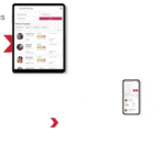
I also created the gif animation used to demo the product at the top of the Solutions pages (such as on the Skills Training page). The designer had created a gif for me, but I needed specific proportions and a frame, so I tried my hand at turning a video into a gif and figured it out.
Description
Carrus
May 2022
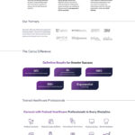
Corporate website for my employer, Carrus. New branding meant we were taking the site in a new, tech-focused direction that required graphic animations and careful responsiveness planning.
